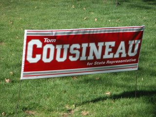
Tom Cousineau, candidate for Brian J. Williams’ seat in the 41st House District, has carefully chosen a yard sign that proudly proclaims his qualifications for elective office:
Yes, nothing says “I was a famous athlete: Elect Me!” like putting up your signs in the Scarlet and Gray. Query: if it is relevant that Cousineau was an All Americanat at OSU, is it equally relevant that he never made a Pro Bowl?
I know Tom, but not well. Frankly, he don't say much. He certainly isn’t the kind of guy with whom one would start a conversation with “Don’t you think section 23 of House Bill 347 is subject to ERISA pre-emption?”
I have no idea if Tom is getting out of the primary. He is, by report, a favorite of the state party, but his opponent is from Twinsburg. The 41st is overwhelmingly a suburban district, suspicious of all things emanating from the centra city. I’m not privy to Republican event schedules, so I can’t guage who is out and what people are saying about the candidates.
While I make fun of the sign for its transparent invocation of a past that says nothing of his prospects as a legislator, it is a hell of a nice sign. Using a long narrow sign to accommodate his longish name is a brilliant stroke, giving the sign a unique, eye-catching look. The unusual shape probably wasn’t cheap either.
Most of all, you can read it a mile off. It’s clear that some candidates do no check how well a sign reads at distance. Some signs just turn into blobs of too much color until you get right up on them.
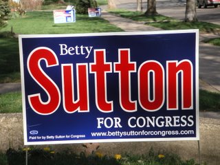
And who picked this unfortunate color scheme?
*Sigh* With everything stacked against her, Betty really needed to run a perfect campaign to have a chance. This campaign has been less than perfect.
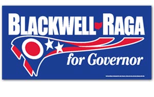
Meanwhile. Blackwell/Raga signs are popping up here and there, and the design is creeping me out: I’m hoping it’s just my liberal paranoia, but doesn’t that thing under the names look like an Ohio flag morphing into a hobnail boot?
RIP, JOHN OLESKY
1 year ago


6 comments:
Nice posting.
Cousineau's in it. The fact that he and Steve Murphy are both inthe race is the result of a huge screw-up by Alex Arshinkoff (beginning to resemble a Keystone Kop).
Arshinkoff simultantiously talked both men into running and a communication breakdown led to both filing for the job. Both have reason to be pissed.
They are both endorsed by the party.
Blackwell's signs are badly designed. You have to look real hard for them.
Cousineau's probably don't cost anymore than a standard size sign, but the length is better suited to his long last name.
You can't go wrong with white letters on a dark blue background.
Anonymous is right about the Blackwell-Raga signs. Their names should have been on top of each other rather than side-by-side. The letters are too small. The Petro-Padgett signs are much more legible at a distance.
I agree with A and Jason about the B/R signs, but also with Donkey about why they don't matter. Blackwell already has huge name rec. and doens't need signs to do it for him. Now he's trying to create a brand for the general -- though in my mind a brand with a creepy graphic on it.
For Cousineau and Sutton, they need signs that will build name recognition. In Counsineau's case, this is a success; in Sutton's a failure. You literally can't read the Sutton sign until you are about 20 feet away.
That Cousineau's sign offers a stepping stone for critiquing his entire candidacy matters only if it happens somewhere beyond the blogs, as Capri's continued success shows.
On the Cousineau signs -
I don't think that I've ever seen a yard sign - at least a good one -that had more than two purpopses:
1. Build name recogniton.
2. Plant 'nuff of 'em to look really, really popular.
There's a local candidate for Judge, whose name I forget, whose signs have the tag line "experience counts". Only implies that the candidate has experience - doesn't claim it.
BMD:
The candidate in question is John Quinn, running for the Edna Boyle gimme seat in the 6th District, who is a good candidate with experience as a Domestic Relations judge. The problem is, he's running against Clair Dickenson, a smarter lawyer with experience as an appellate court judge.
I like the blatant branding of the Cousineau's sign. But will he be able to overcome a French name in a Republican primary?
The Blackwell/Raga monstrosity sucks toast. Are they trying to re-imagine the Ohio flag as a Reebok logo? Or just creating some scary, one-eyed, tentacle thing?
Post a Comment